Project 06 / 06 · website
TAGLIO Soho
A concept website for a fictional Roman pizza al taglio shop in Soho, London. TAGLIO is not a real pizzeria; this is a concept, not client work.
Overview
Screenshots
Evidence tier: Existing evidence

See proof
Claim
TAGLIO Soho: a concept website for a fictional Roman pizza al taglio shop in Soho, London. TAGLIO is not a real pizzeria; this is a concept, not client work.
Stated by Danilo
Evidence
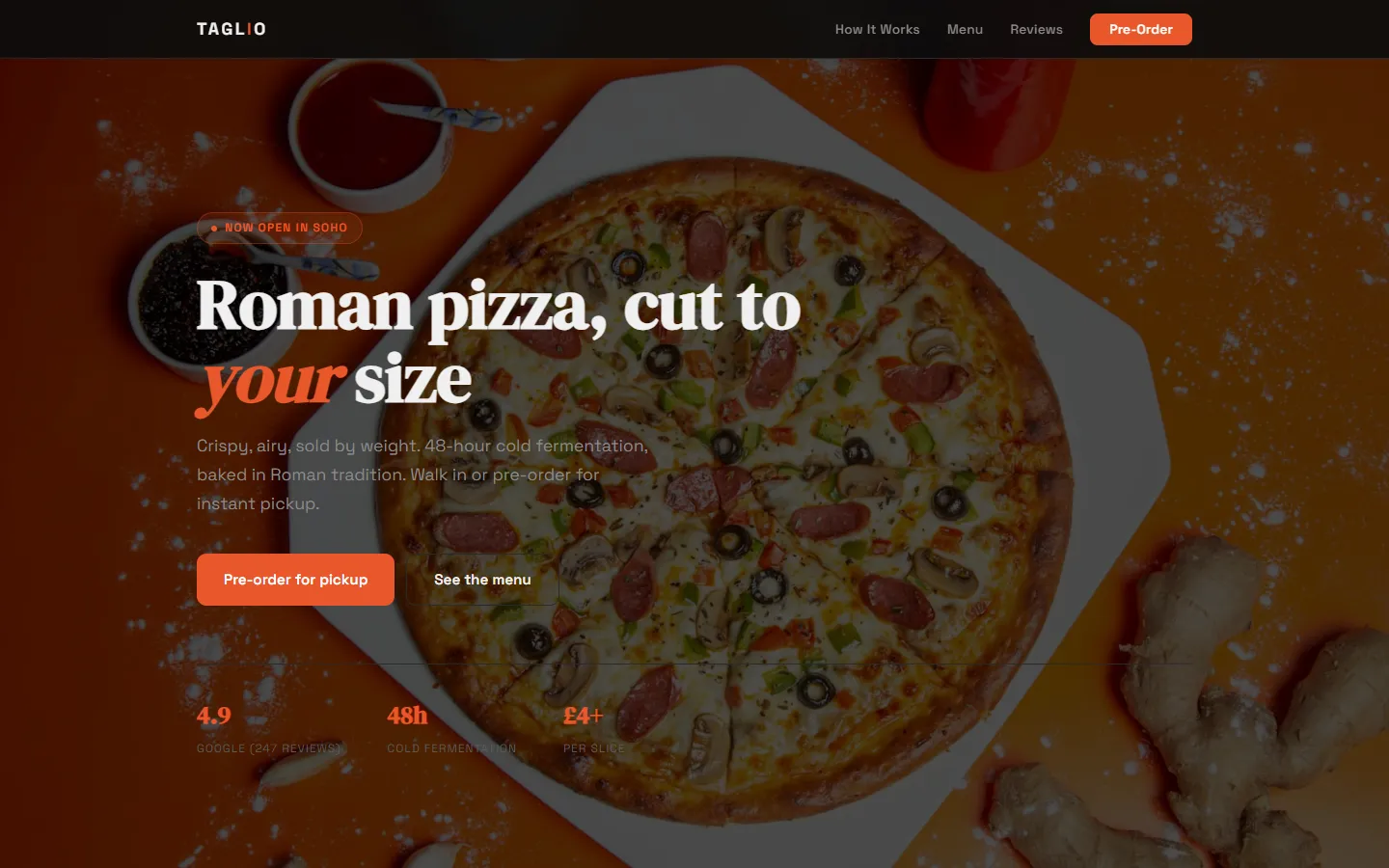
- Screenshots of the TAGLIO Soho concept page (desktop and mobile) · manual · checked 29 September 2026Taken on 29/09/2026 from the page's own source file, because it is not online.
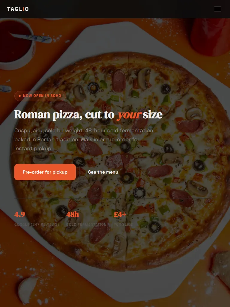
- Screenshot of the TAGLIO Soho concept page at tablet width (768 px) · manual · checked 29 September 2026Taken on 29/09/2026 from the page's own source file.
- TAGLIO source: the mobile breakpoint (CSS) (index.html, lines 298–315) · manual · checked 29 September 2026Copied verbatim from the real source file on 29/09/2026 (line endings normalised).
- TAGLIO source: the desktop grids (CSS) (index.html, lines 189–207) · manual · checked 29 September 2026Copied verbatim from the real source file on 29/09/2026 (line endings normalised).
Result
Real screenshots of the page, taken from its source file on 29/09/2026. That Danilo built it is his statement.
On this page
- 02 Responsive: the page captured at 1440, 768 and 375 px
- 03 Code: the CSS that changes the layout between widths
Not on this page
- Live: TAGLIO is a concept for a fictional business and is not online.
Responsive
The same page at three widths, drawn at the same scale: each frame is a capture of the page, and the ruler above it is its viewport width.
Evidence tier: Existing evidence
Code
Grids of three and two columns on wide screens; one breakpoint at 768 px folds them into one column.
/* HOW IT WORKS */
#how { background: var(--surface); border-radius: 0; }
.steps { display: grid; grid-template-columns: repeat(3, 1fr); gap: 32px; }
.step {
padding: 32px; background: var(--surface-2); border-radius: var(--radius);
border: 1px solid var(--border); position: relative;
}
.step-num {
font-family: var(--font-display); font-size: 2.5rem; color: var(--accent);
opacity: 0.3; position: absolute; top: 20px; right: 24px;
}
.step h3 { font-size: 1.05rem; font-weight: 600; margin-bottom: 8px; }
.step p { font-size: 0.85rem; color: var(--text-muted); }
/* MENU */
#menu { background: var(--bg); }
.menu-grid {
display: grid; grid-template-columns: repeat(2, 1fr); gap: 16px;
}
Evidence tier: Existing evidence
/* MOBILE */
@media (max-width: 768px) {
.nav-links { display: none; }
.nav-ham { display: flex; }
.nav-links.open {
display: flex; flex-direction: column; position: absolute;
top: 60px; left: 0; right: 0; background: var(--bg);
padding: 20px 24px; border-bottom: 1px solid var(--border); gap: 16px;
}
.hero h1 { font-size: 2.4rem; }
.hero-stats { gap: 24px; flex-wrap: wrap; }
.steps { grid-template-columns: 1fr; }
.menu-grid { grid-template-columns: 1fr; }
.gallery-grid { grid-template-columns: 1fr; }
.gallery-grid img:first-child { grid-row: span 1; height: 280px; }
.reviews-row { grid-template-columns: 1fr; }
.footer-grid { grid-template-columns: 1fr 1fr; gap: 32px; }
}
Evidence tier: Existing evidence